Luther Memorial Church
Website and Branding
Luther Memorial Church located in Des Moines, IA, decided to update their overall website and branding. To help, they enlisted a team of young professionals from their congregation to help . That included me.
OLD SITE AND LOGO
The old site and logo worked but was getting old and outdated. The old website was hosted on a platform that was difficult expect for only the church's current webmaster to access. So they wanted something that would be easier for everyone to access. The old logo was easy to recognize, but when scaled down, the font around it was too hard to read and some of the lines were too thin. The rest of the church's branding didn't fit in with what was on the website or the other materials they had such as their church bulletin, business cards, cards, and stationary.

Old website
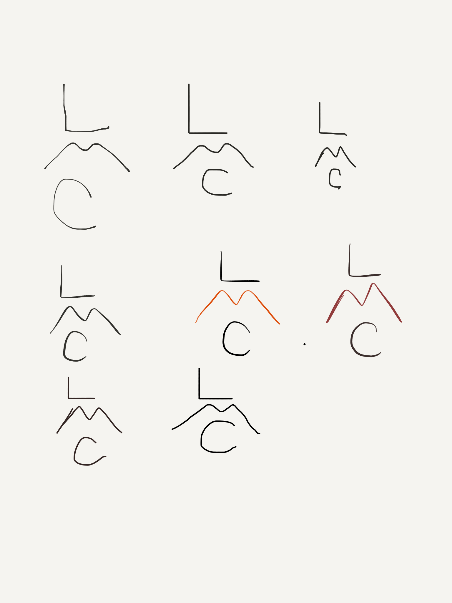
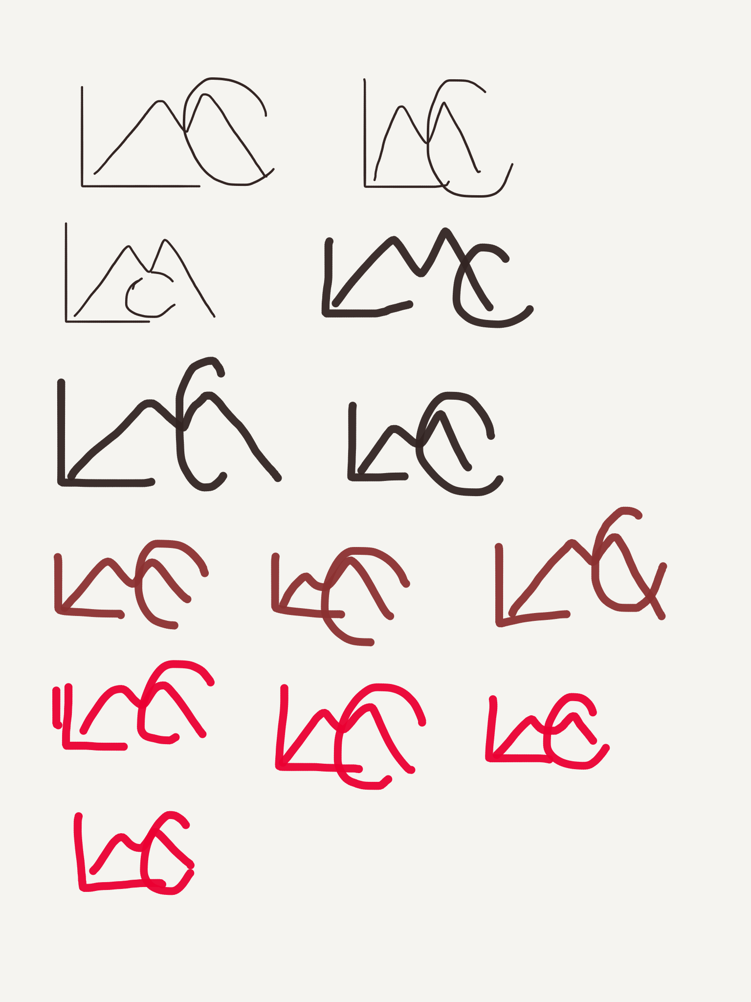
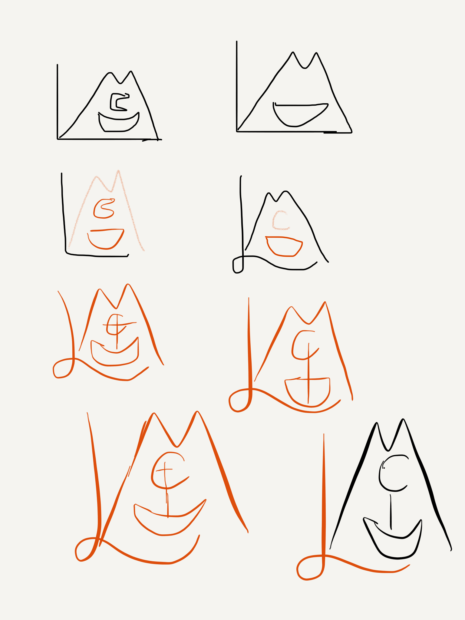
SKETCHES
I originally tried to push for something completely new than what they already had. But ultimately, we decided against it and went with a more modern version of the old logo.

NEW SITE and BRANDING
To come up with the new site and branding, I met with church leaders to discuss the church's history and goals going forward. The church was originally built by Danish immigrants in the late 1800s and still to this day, they hold onto that identity. But with a growing body of members, and more young people, they wanted an updated look that would reflect the modern age and their heritage as well.
For the website, a team of church members, including the original webmaster and a photographer and I, got together and worked on the website. We spent a while figuring out what template we wanted, knowing that we were going to do Wordpress so it would be easier for the church leaders to edit themselves later on. I worked on adding in details, fixing the layouts of pages, and coming up with a color scheme.
Fonts Chosen: Cocomat and Embria
Color Scheme: #e21421 (a bright cherry red), #000000 (pure black), and #ffffff (white)
The new logo is a more modern version of the old logo. It’s also easier to recognize and doesn’t involve trying to read anything at small sizes. It’s a nice, easy mark to recognize at a glance.
The ship in the logo was the most important. It plays a big role in the church history. The church along with Grand View University was founded by Danish immigrants in the 1800s. Inside the church and the university Old Main are two detailed wooden ships that pay homage to their history and traditions.
In order to keep it easy to print and look at, I tried to make the ship as simple as possible so it would show up well at small and large sizes. It also looks more like the original ships in the church.
New Logo
For the color scheme, we based it off some basic colors. The Cherry Red is based off the church front doors which can be seen in the original website picture. We wanted to bring a little bit of the church history in every touch implemented.

Site Map Sketch

Website Theme: Faith
Hosted via: Wordpress
