Saigo University Branding
Type: Student work
Assignment: To create branding for an imagined university and a sister school. Pieces needed included a brochure, postcard, logos, business card, and social media accounts. The sister school had to be outside the city, state, or country from where the university is located.

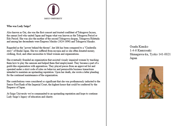

I started with the main university, Saigo, based in Tokyo. It's named after Lady Saigo, who was one of the wives of Tokugawa Ieyasu who ruled as as the Edo Period's first shogun. Lady Saigo was known for her generosity and intelligence, and started a school to help women who also dealt with blindness learn new skills and find jobs.
So I based the school's logo off of her family crest and decided to go with the color purple since in Japan its a symbol of royalty. My imagined school would be an all girls' school and their mascot would be the Ho-o (the Japanese firebird, a symbol of queens).
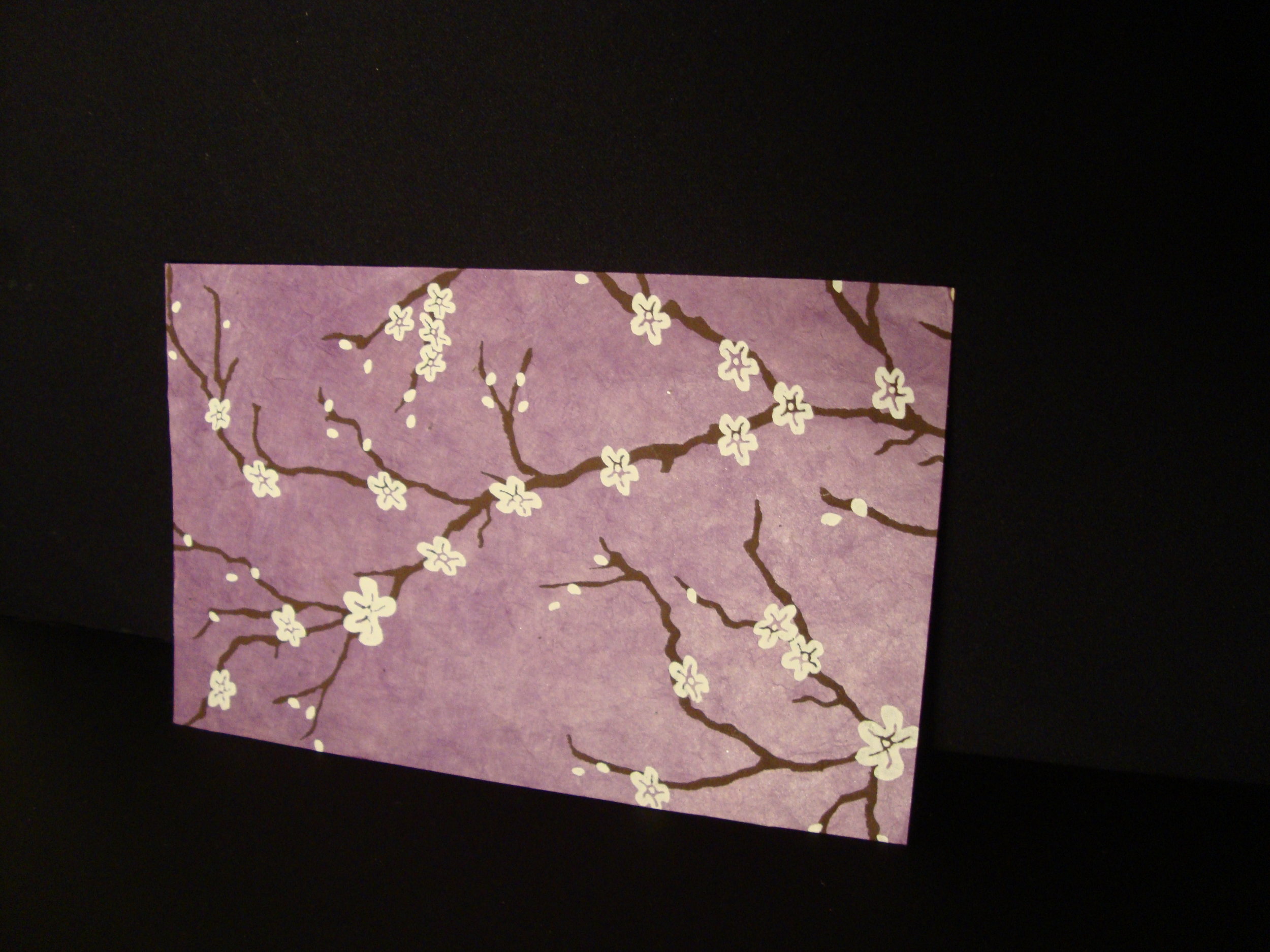
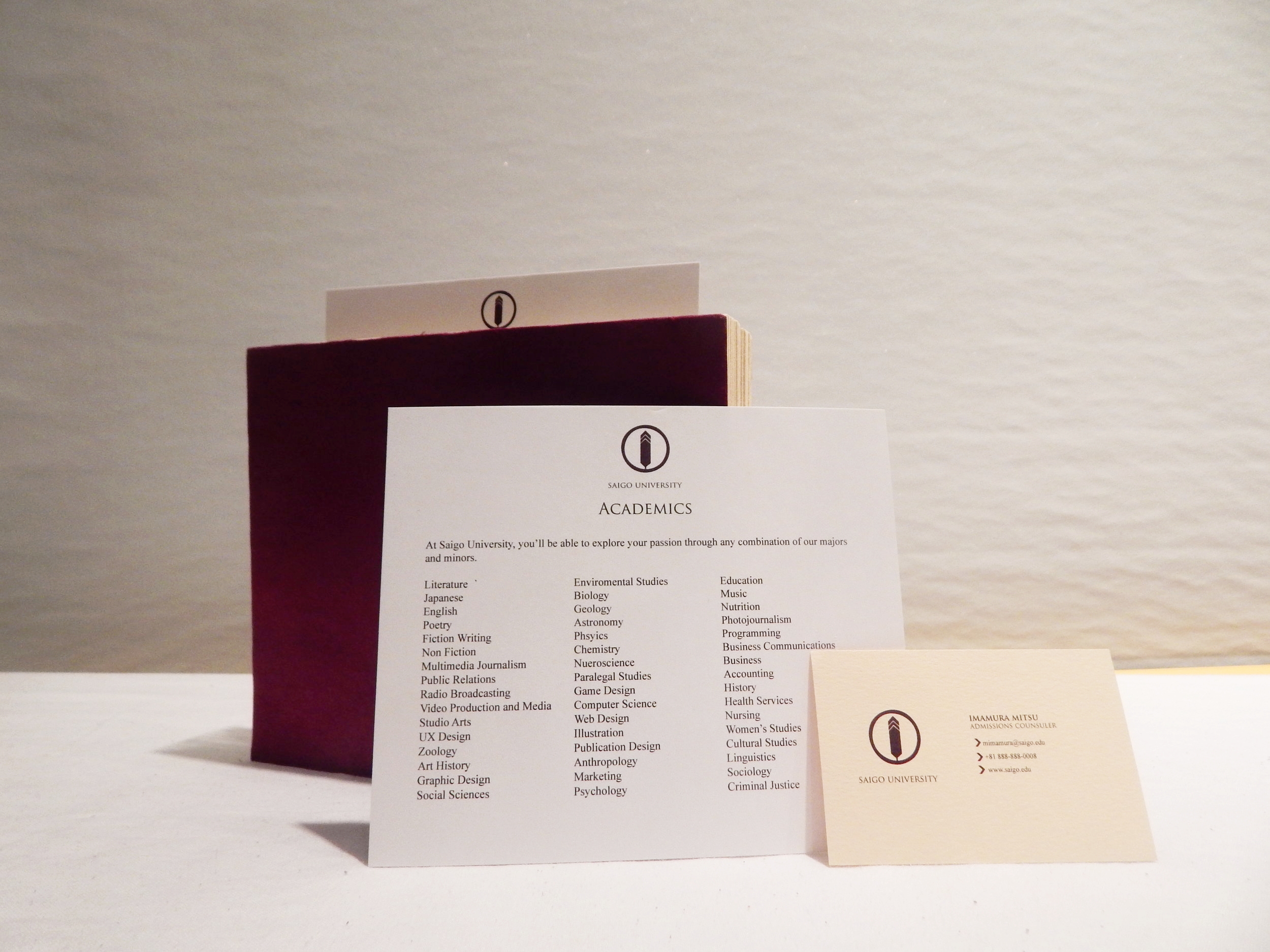
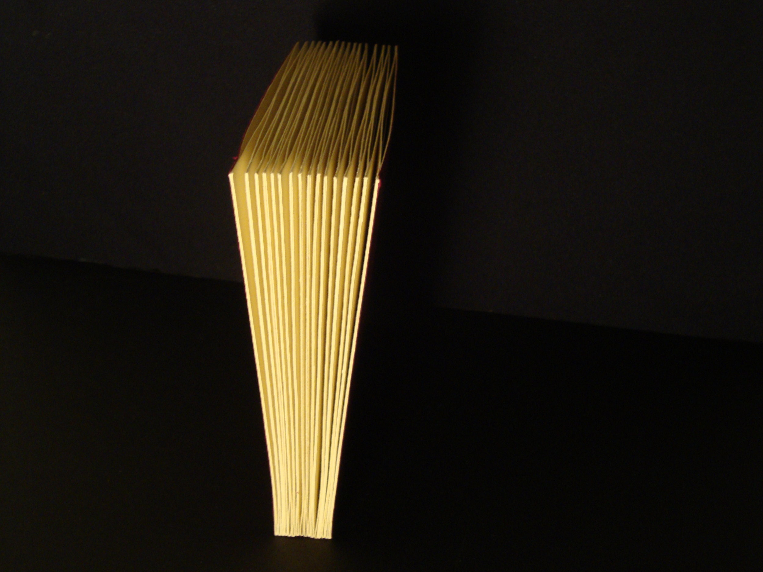
My brochure when spread out, resembles the Japanese folding fan and contains 42 cards each with specifics on housing, sports, academics, life in Tokyo, etc. My post card in front is purple with cherry blossoms and the back gives a picture of Lady Saigo and a short overview of her life.

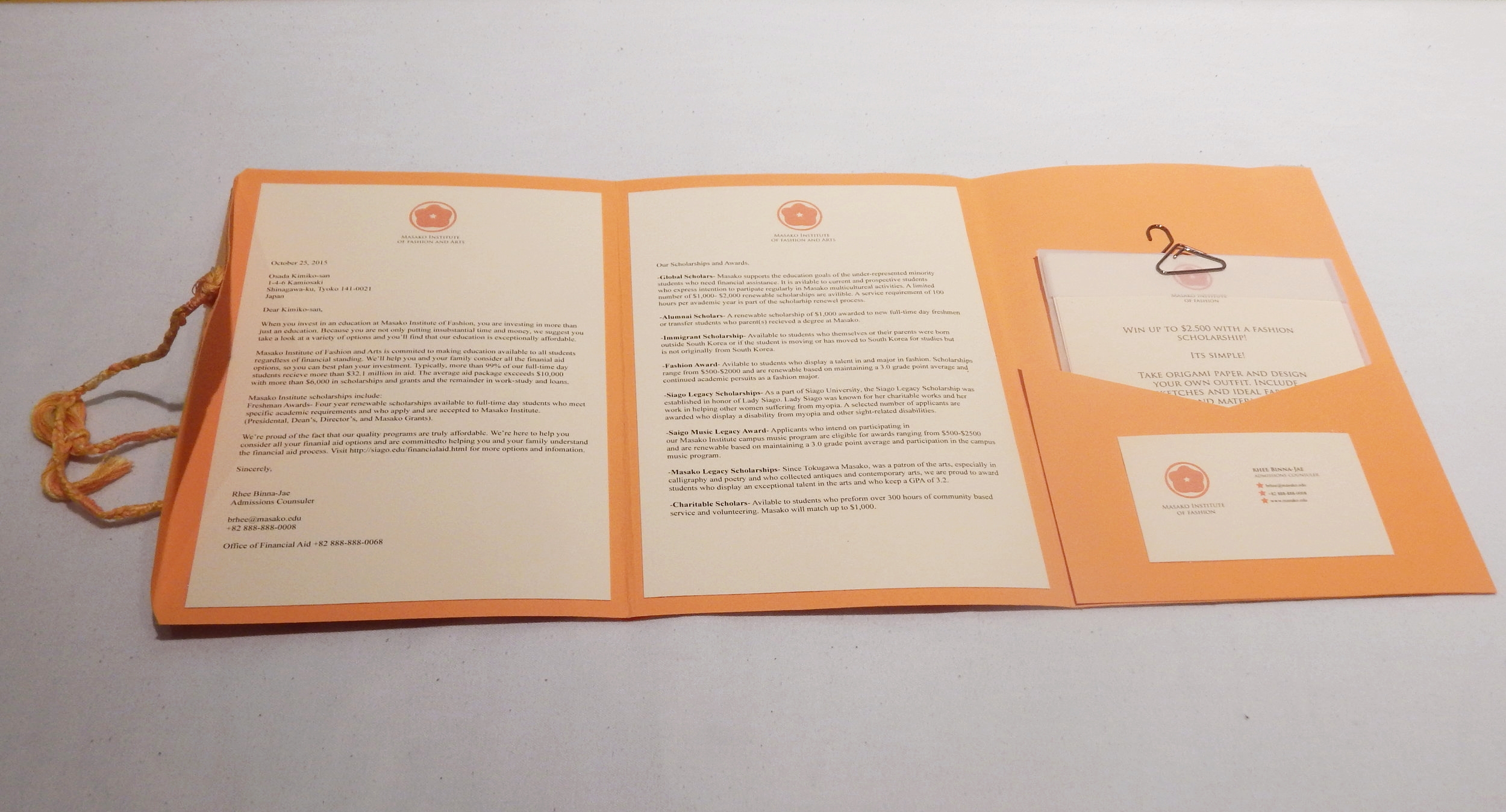

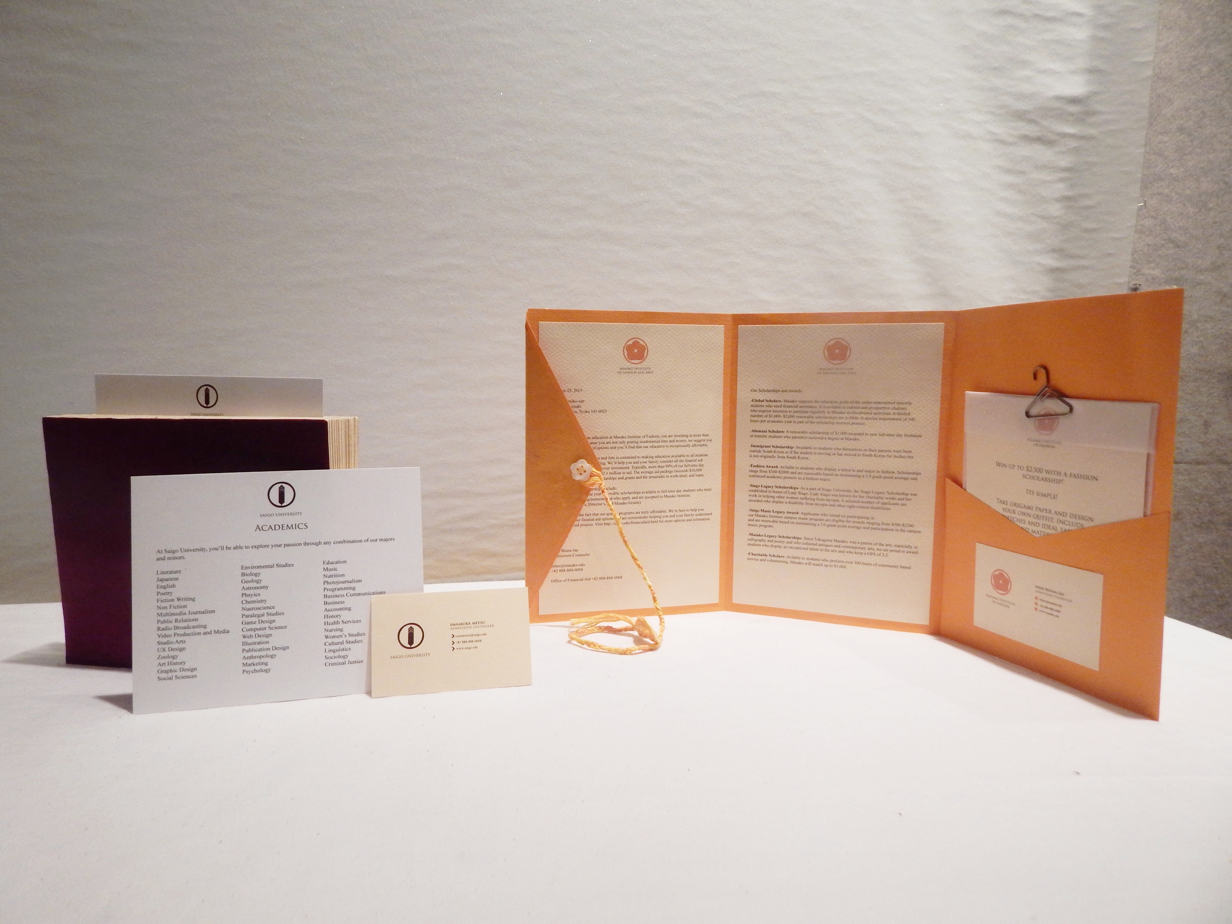
The other piece I created was for the sister school based out in Seoul, South Korea. Since one of the themes of the sister schools could be fashion and it had to be based either outside of the city, state, or country of the university, I thought it would make sense to have a fashion school based in one of the fashion capitals of the world.
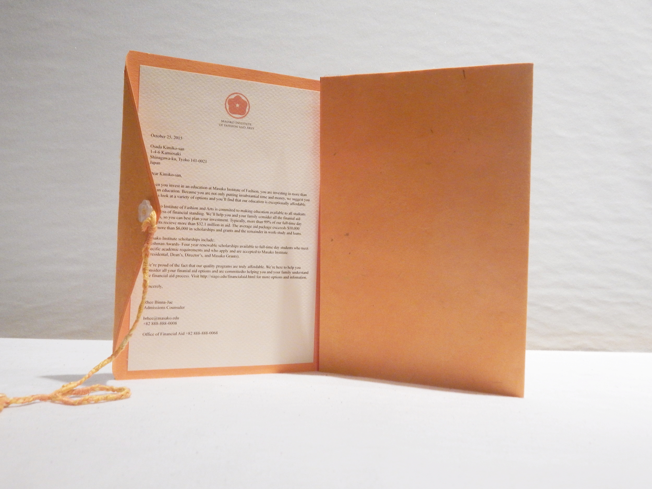
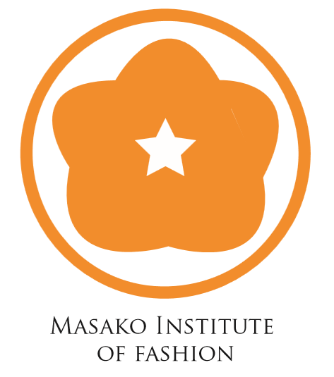
This school is named for Masako Tokugawa, the grand daughter of Lady Saigo and empress consort to Emperor Go-Mizunoo. Her own daughter would go on to become Empress Meisho, one of Japan's only eight reigning Empresses. Masako was known for being a patron of arts so I thought it would be appropriate to name the school after her and as the grand-daughter of Lady Saigo, would help give the sister school a connection to Saigo University.
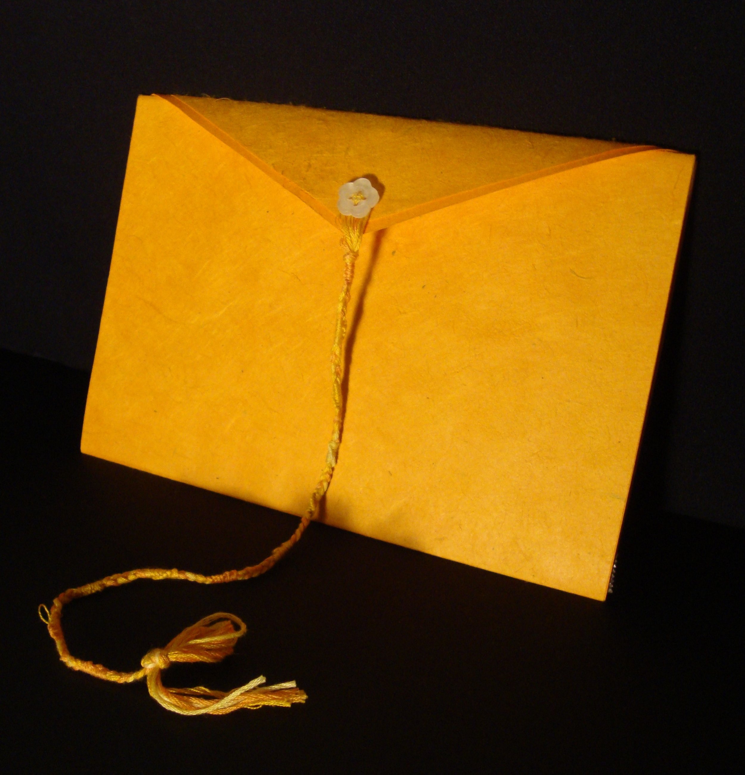
The logo is based off the Japanese Chrysanthemum, the Japanese Imperial family's mon, or family crest and imperial seal. Since Masako was an empress consort, I thought this would make sense. The color, a yellow-orange is supposed to be similar to gold which was important to Korea's imperial family.
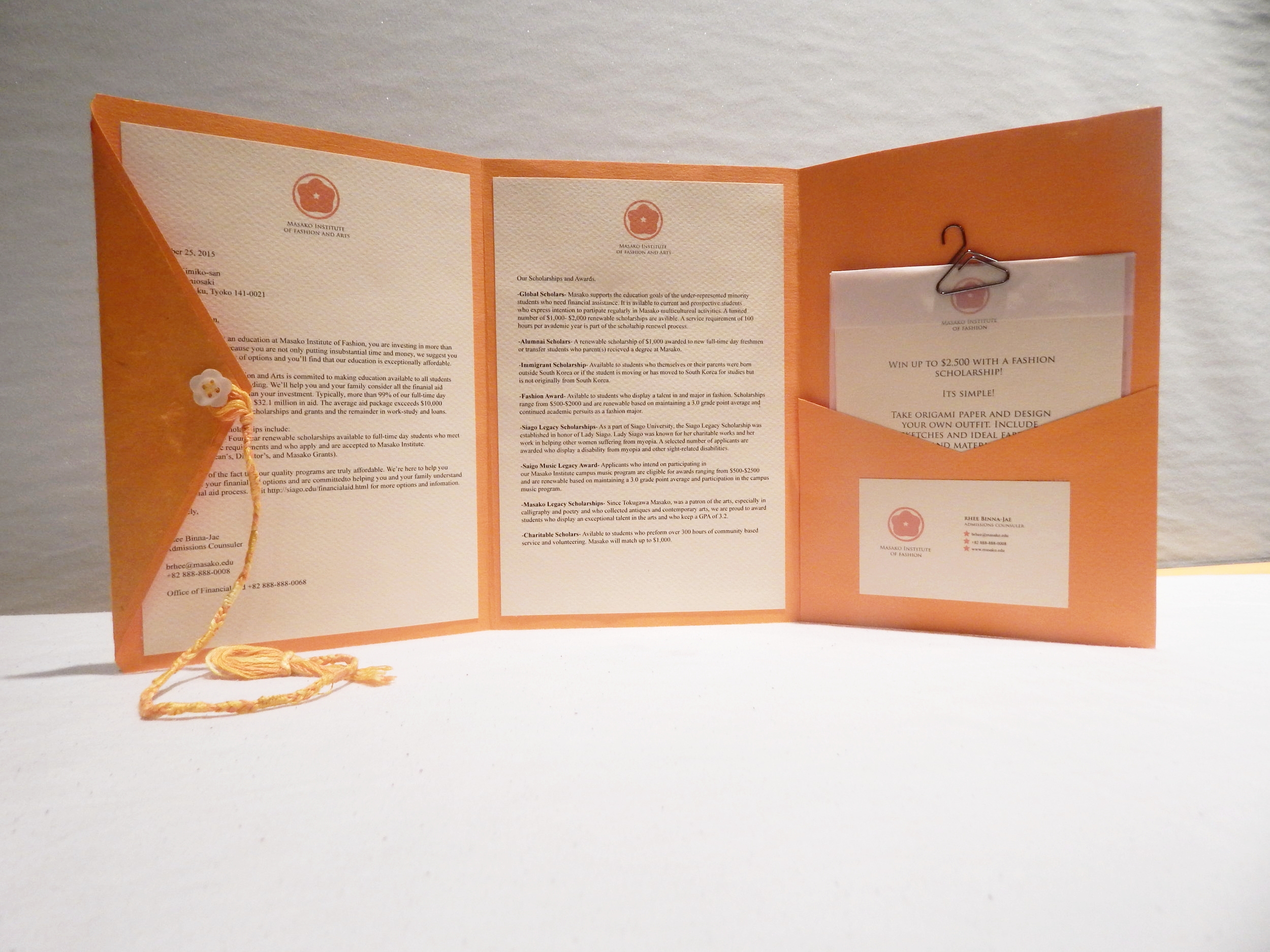
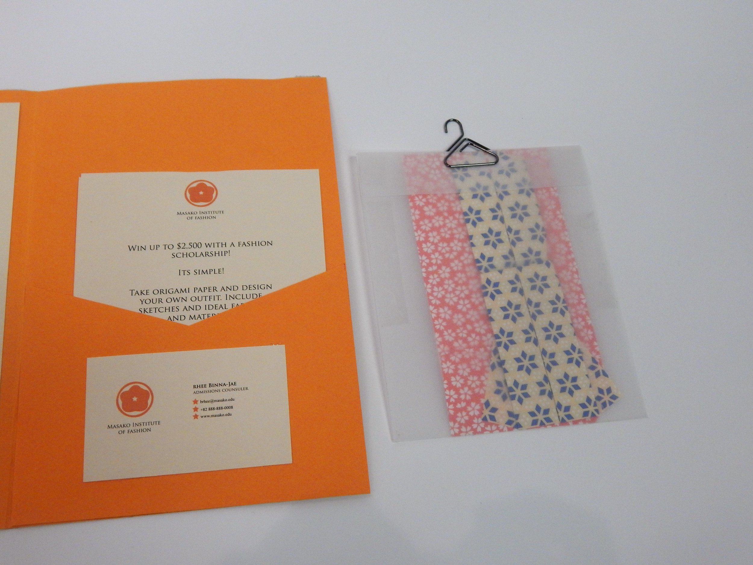
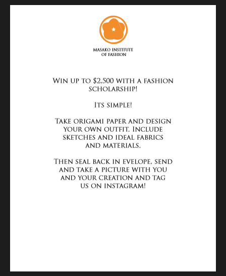
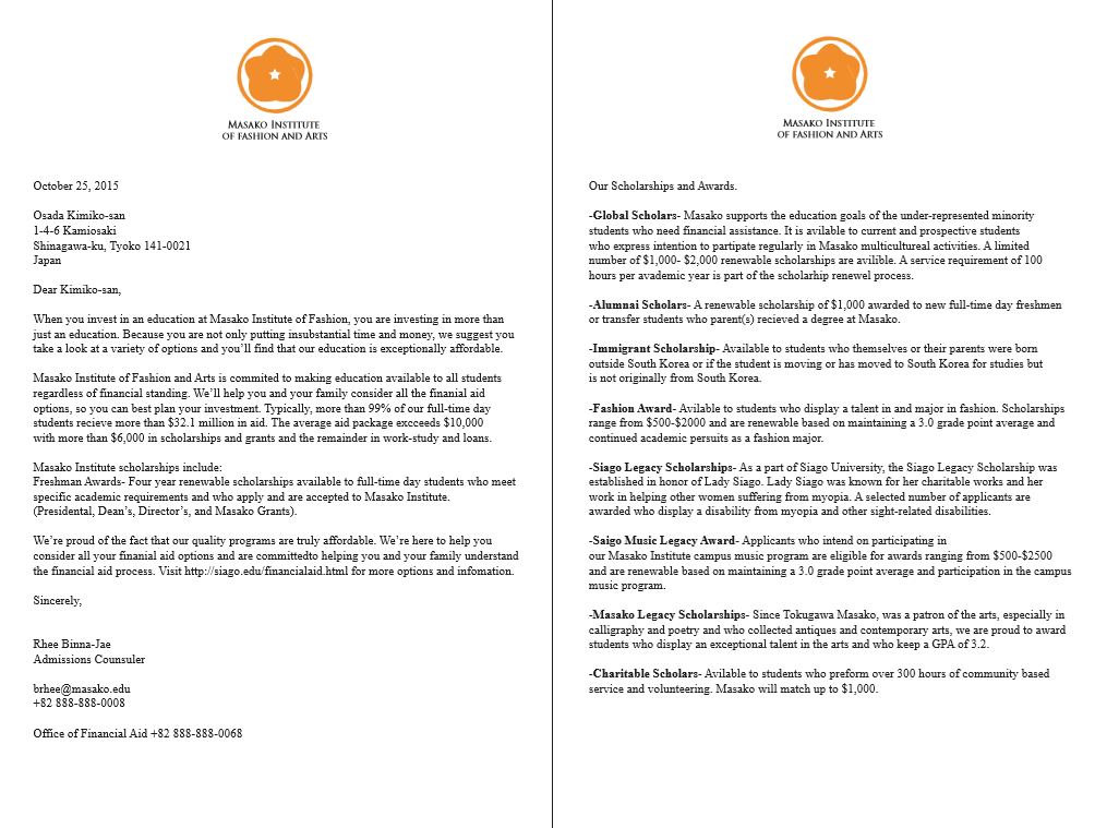
This brochure is for financial information and contains an interactive contest for students to win a scholarship. The idea is that prospective students would fold the origami into fashionable pieces and then submit a photo on Instagram to the school to be entered in the contest.
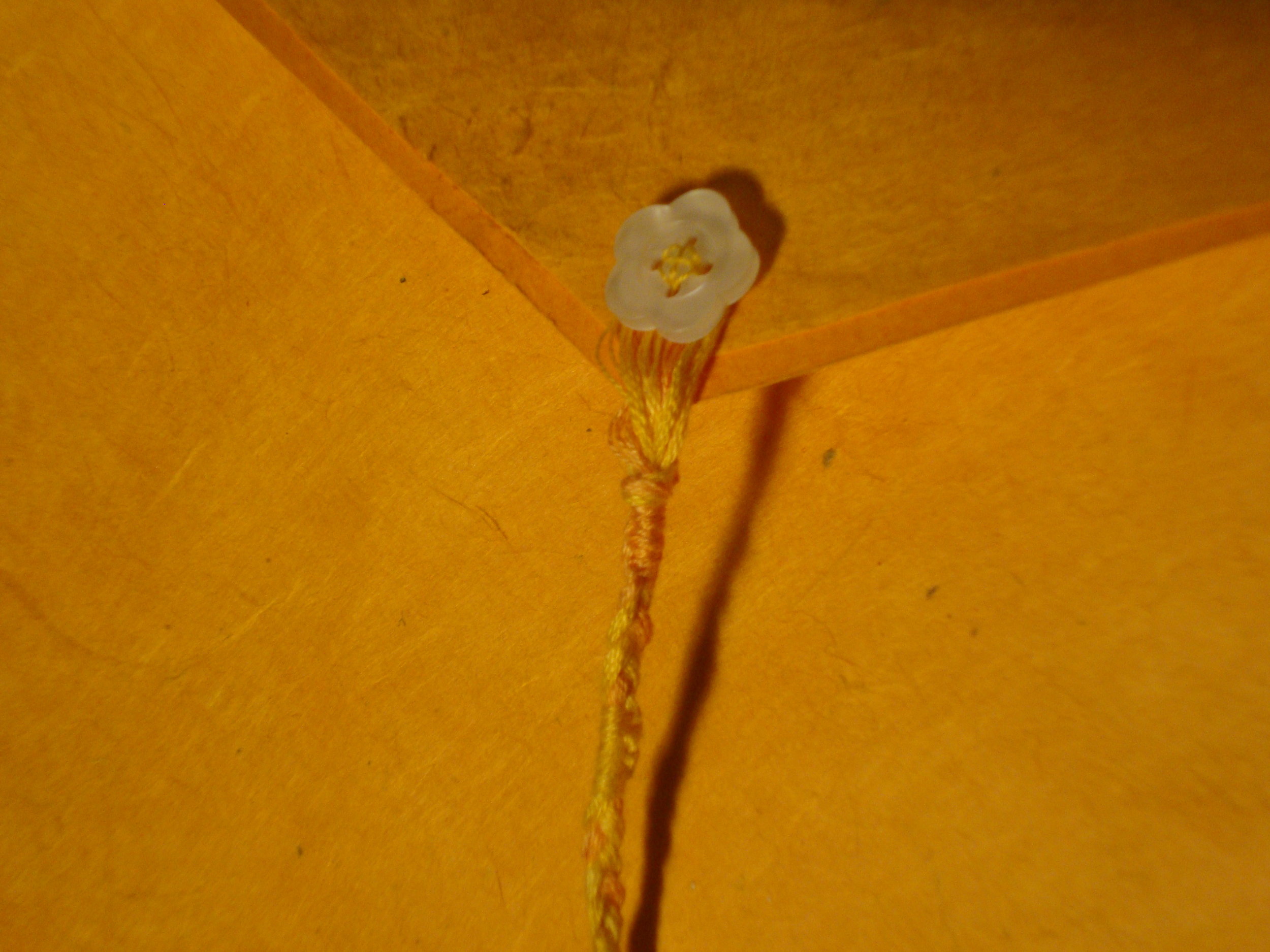
On the outside, a button similar in shape to the logo ties the mailer/broshure shut with a handmade cord that alternates with eight knots (eight being a symbol in Japanese mythology of an enternal number).

The final pieces were a social media campaign, so I created social media for Masako Institute of Fashion on Instagram and there are also an Instagram and Twitter for a would be second sister school, Hyogo Institute of Cooking that isn't shown here.