Goodreads: A Casestudy of Outdated UX

I’ve always been a big fan of Goodreads since I first discovered it a long time ago. Like most people, I mostly use it to keep track of what books I have read and what books I want to read.
Since college, I have been in the process of getting rid of a lot of my books. Because of this, I also need a way to keep track of what I have and haven’t read. I also rent out a lot of books from the library. So Goodreads tracking system is pretty stellar.
However, Goodreads has a lot of draw backs that are well known within the community. Mainly, I believe the criticism is due to a lack of user experience design and any recently updated styles.
Goodreads Flaws and Pros
Goodreads is now owned by Amazon which in some cases makes sense because it started as an online bookstore and you can directly buy and review books from Goodreads now. However, with that kind of backing, one would think they have a lot more money and teams to commit to upgrading Goodreads.
Although they have an app now, the app functionally isn’t well usable. The IOS and Android versions also have different capabilities.
If Goodreads was still and indie site, this would be something I would expect. However to be owned by the world’s largest company and have all these issues after years is inexcusable.
Maybe it’s one of those things they thought would bring them lots of money but it hasn’t worked out so they stopped. But also maybe it’s one of those things Amazon wanted a monopoly on.
Goodreads also has several competitors which I’ll talk down more towards the end. If Goodreads wants to stay on top, I believe they will soon have to create a better designed site or risk slowly fading away as users continue to get frustrated.
This post was inspired by several tweets I saw earlier this year.
A summary of Key Offenses
Letting Users rate books that haven’t been published yet
I imagine this was done so that users can submit reviews of ARCs. However, I’m positive there should be a system in which to only allow these reviewers to post early instead of everyone. Otherwise you end up with a lot of non reviews like “can’t wait!” And “I hated the last one.” I think instead, users could submit comments until the book is released.
No way to let readers with arcs just leave reviews
Not letting authors control their profile pages
I honestly don’t know why this isn’t a feature. Authors should have total control over their books being listed and how they appear.
People abusing one stars and ranting for no good reasons - Goodreads needs a moderation system in place to prevent these kinds of reviews. If a reader genuinely didn’t like a book that’s one thing. But it’s pretty common to see personal attacks against the author or rants just to rant about something.
Isn’t moderated very well so easy to leave offensive comments and reviews
To quote “Almost Everything About Goodreads is Broken” on OneZero,
”It isn’t even just that the reviews are demoralizing and depressing; according to Michael and several other book publishing professionals I spoke to, having a lot of positive reviews privileges your book in the Goodreads promotion ecosystem, making it more likely that books will be mentioned in end-of-year reviews and, of course, be eligible for the annual Goodreads Choice Awards. So, if you have a massive influx of Goodreads users who, for whatever reason, dislike you as a person, they can leave reviews indicating that your book is awful, destroying an author’s chance of successful promotion on the platform.”
Knowing this about the way authors get into the Goodreads Choice Awards is awful. I hadn’t realized books got selected based off this. On one hand, this makes sense why authors get so upset about bad reviews on Goodreads now because it hurts their changes.
However that doesn’t make it any better when authors rant against bad reviews…
Audiobooks aren’t labeled as books
Given the amount of people who use audiobooks these days and listen to podcasts, this should be high priority. It counts as reading even if you listen to it so why isn’t this a feature. It’s not like audiobooks didn’t exist until recently, they were easily on CD and tape when I was little.
Librarians help maintain the site for free
Listen, I get when you try to catalog every book like this, you can’t possibly hire enough people to handle it for you but Amazon owns Goodreads and they have enough money to hire people to maintain the books for them. No excuses.
No half star ratings
In the year 2020, this is unacceptable. I KNOW that it isn’t THAT HARD to create half star ratings. We have insane web animations now, the developers at Goodreads can spend at the very least some time to this.
Search bar doesn’t work very well
Also unacceptable. The search functions for every other app can work very well, this is something that is fixable. If a user tries to enter in a title but doesn’t type in it correctly, the book or author won’t show up at all. And even when they’re accurately entered, it’s often not the first title listed, users need to read through the results to find it.
The Shelving Needs to be Rethought
A big complain I’ve heard is the lack of a DNF (Did Not Finish) shelf which encourages users to either dump books entirely or “finish” but leave no stars or reviews. There is work arounds, but it is more complicated than it needs to be.
Another issue with this is that almost any book you add gets automatically added to Goodreads’ three shelves, To-Read, Currently Reading, or Read. There is apparently a way around this, but again it shouldn’t have to be that way.
You can’t reply directly to people in comments
Just annoying.
UI doesn’t seem updated since 2007, is unimaginative, and clunky
The biggest complaint in my book.
As a designer, I have THOUGHTS about the design of Goodreads and how it’s being used. My main issues with the design of it is that a lot of text is way too small, there’s not enough space in between certain areas, and there’s not enough weight or color different in the font(s).
If you take a look on the Wayback Machine (the internet archive of websites) you can tell that the website’s look and interface has barely been updated since 2007 despite the sheer number of books being added every day and users to continue to browse the website.
Things I think Goodreads does well
Their groups/discussions are a great idea for book clubs and talking about books you like.
Creating lists is great for discovering new books
Ability to discover so much information about a book just on it’s page
Goodreads reading challenge
Reader’s choice awards
Bookshelves
Features I think are UNNECESSARY
Quizzes/Trivia
Quotes
Ask the Author
Creative Writing
Asking me to log in again every time I go to my profile or certain sections of the website. I get this is for security purposes, but for a user, it’s very annoying.
I enjoy these features on Goodreads, but I don’t think they are used that often or they don’t make a lot of sense.
For example, Goodreads is a reading site. Often people who love books also love writing their own stories. I don’t think Goodreads’ creative writing section is bad, but it seems to be a half baked idea. It’s also buried among other things and it’s hard to locate specific stories.
I could see Goodreads helping to host a sister site made for unpublished authors where it actually is beneficial to writers. A dedicated site like Wattpad makes a lot more sense. Personally I wouldn’t upload my stories to Goodreads because there is no copy and paste block. Anyone could steal those stories.
Goodreads seems to struggle with an identity crisis of sorts. Trying to be the all in all to book lovers and authors. However in this regards, they fall sort and are doing their users a disservice.
What I would redesign page by page.
To improve Goodreads, we first need to take a look at what people are actually using the site for.
According to the comments left on the Goodreads Twitter threads, users primarily use:
The book shelving system (which can be improved)
The book pages
Reviews
Goodreads challenges
Author profiles
Community forums and groups
Based on that information alone, we have a lot of clutter we can cut out from the UI and simplify it.
Author’s note: I’m not going to dissect every single page, but I am going to touch on the main/important pages.
The Homepage

The homepage by today’s standards is very cluttered although lack a lot of ads which is nice.
On the web version, the site features a 3 column grid and navigation. Following the rule of Z patterns, the navigation makes a lot of sense. You have the logo, the main sections, and then the user’s personal information on the other side of the search bar.
However, below the navigation, there isn’t a lot of padding in between in the columns. A lot of social media sites have a news feed and a similar layout. However in the case of Twitter and Facebook, they’ve added in a lot of white space which helps give everything a lot more breathing room.
If I was redesigning this, I would keep the newsfeed, however I would give everything a lot more space. I would also make each of the side sections stand out more so they don’t all blend together.
Having the “footer” on the side like that is alright, there isn’t a lot of other places to put it since we have a never ending scroll. However, since this is a social media site for books, I’m not really sure it’s needed.
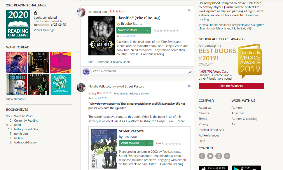
The Bookshelves

This page is a lot of data. And by data, I mean it’s not very pretty to look at no matter how you change the view. Even on the desktop, all of the reading data is small and somewhat hard to read. I bet they want to have it be at a glance, but it’s not very user friendly.
Instead of all the lines, they could use alternating colors and I think better usage of different font weights would make it easier to read. I think instead of blue, the links should be black except for whatever you’re using using. It screams HTML tables to me.
Don’t even talk to me about the alternative view with just the covers. I think they’re too small and the 6x5 grid is way too small. Plus viewing it like this gets rid of all the data, you have to put it in the other view to see your reading data.
I think in the cover view, the data could be listed underneath the covers instead or the pop-up when you hover over the covers could show your data. It’s a little more eye pleasing but not great.
With the books, I think the covers should bit a big bigger, regardless of how you’re viewing them.
I think the amount of data the show is fine, it tells me pretty much everything I want to know about the books I’ve read or haven’t read.
The Discussions page

I hate the discussion page. It’s so outdated Goodness Gracious.
First of all, I would get rid of the square icons and replace them with either a bigger image or something else. I would wrap the discussion areas in white and make the background another color. The text would be black instead of that weird click text color they have going on. It’s not even hypertext blue actually.
If I was to grayscale this page (or any other page on Goodreads thats mostly just links) the text becomes really hard to read. Some of it is way to pale to be easily accessible to people with vision issues.
Then, I would make the titles larger, probably honestly get rid of the discussions links preview and maybe put one or two in my bubbles.
The sidebar could stay, it’s not too awful like that.
Going into a discussion though is even messier.
It’s not bad but there is a lot of link colors and not a lot of contrast between the font colors, weights, and families. It’s very bland.
I don’t have very good vision actually and it’s hard for me to read everything very well. I have to concentrate to read everything.
Showing groups: books | both is really hard to read and it’s so outdated.
Start a new discussion is also really small and hard to read. Not only that but it’s all on one line and there’s barely any space between the secondary navigation and the discussions.
The Groups page

Actually…what is the difference between the groups page and the discussions page? I’m honestly not even positive.
However, I do like the way the Groups page is set up better than the discussions page. There is a lot more breathing room in the genres list, there is much more font contrast, it’s not nearly as cluttered, and it’s easier to read.
The author pages

As someone who DOESN’T HAVE PERMISSION TO EDIT AN AUTHOR’S PAGE WHY DO I SEE AN OPTION TO CLICK ON A LINK TO DO SO.
breaths deeply
screams
So one of the basic things you learn in design is that if an user doesn’t have the option to do something, you don’t show it to them, unless it’s something they can easily gain access to later. Since I am not the author and never will be, WHY DO I HAVE AN EDIT DATA LINK.
I shouldn’t have a link or a pop-up for this.
Anyways, let’s move on.
My next room for concern is like most of Goodreads, the text is hard to read and very small. I have my browser at 100% and I am having trouble reading everything correctly.
The website, Twitter, and Member data should not be that small. Also why is her social media links not there right away and instead we have to click on her username?

If you scroll down the column, you see her list of books which is great. I really appreciate that being there. However, scrolling down more, I come across the blog and then her series. Logically, I think series should be underneath the individual books.
However we get the blog, which doesn’t look like a blog. I also have no idea if I’m clicking on the title, another link within the same blog post, or trying to view more on her blog. There is is barely any difference in font size or color for those links.
Not only that but we finally see her social media icons inside the blog section. Which to me makes no sense. Are they for the blog only or are they for her as an author overall? There’s no context given here.
The Competitors Will Eat You
I believe if Goodreads doesn’t decide to clean up it’s website and start listening to their users, their competitors will eat them.
Some options that don’t include websites are spreadsheets and book/reading journals.
But for those people these days are looking for a digital convenient solution, here are some of the ones I found.
I don’t think these apps have the breath and resources that Goodreads have, but they are also basically a catalog site or app.
Booknshelf (The most modern looking of the sites I found.
Other Reading
The Present and Future of Goodreads- Book Riot