Rappaccini's Daughter Poster Design
Final Design After everything was said and done, I mocked up my design in a Photoshop Template to give it a little bit more real look.
In college, we worked with the Des Moines Metro Opera to design posters for several of their shows.
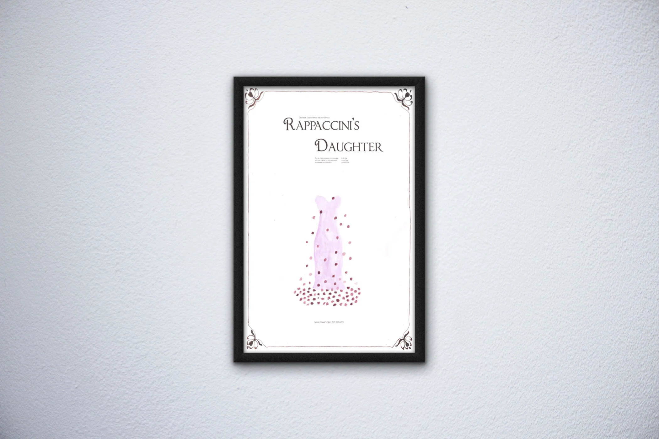
One of them was Rappachini’s Daughter, based off of the short story by Nathaniel Hawthorne. I really enjoyed this one as I thought the story was really interesting. Reminded me a little bit like Romeo and Juliet.
For my design, I wanted to base it off of the dresses I saw that they have used in past shows. While I really liked how dramatic the flowers looked, I wanted to focus on the protagonist. I also thought it would be a nice touch to use handmade items like watercolor to give it a historical feel.

Step 1: Grid the Layout
Since I was making the majority of the poster by hand, I really wanted to make sure that I used a grid. I could have used graph paper, but I wanted to be able to get rid of the lines when I was done. So instead I created the grid by hand using a ruler and pencil.

Step 2: Paint
I used watercolor for the dress and calligraphy ink to give the poster a handmade, historical look. I brought in colors from the show in the dress and decided to have flower petals falling around the dress, making me think of The Beauty and the Beast. For the frame and calligraphy ink, I researched art nouveau flourishes.
Step 3: Work on the typography in Indesign
For my last step, I scanned the artwork, edited the digital file a little in Photoshop so that it would be easier to see digitally, and then put it into Indesign where I used an elegant font to reflect the opera. For the layout of my type, I had a book cover in mind when designing it.